
Design Landing Page Using AIDA
To create a high converting landing page, you need to adhere to the correct structure. Let's take a look at the structure of the landing page and find the perfect landing page layout using AIDA formula.
Landing page is a one-page site that promotes a specific offer and collects contact information for the target audience. The user needs to take a certain action to take advantage of this offer: buy, subscribe, register.
The purpose of the landing page is to focus the user on one offer (service/product) and force the user to take the targeted action. Therefore, all the information on the landing page is aimed at making the user think: "Yes, I need it!"
When a user visits a landing page for the first time, he needs about 5 seconds to understand whether the information is interesting to him and whether he will view it further.
Landing page is a narrative story about an offer, and for it to be effective, the information must be clear and convincing. To achieve this, a certain structure must be observed.
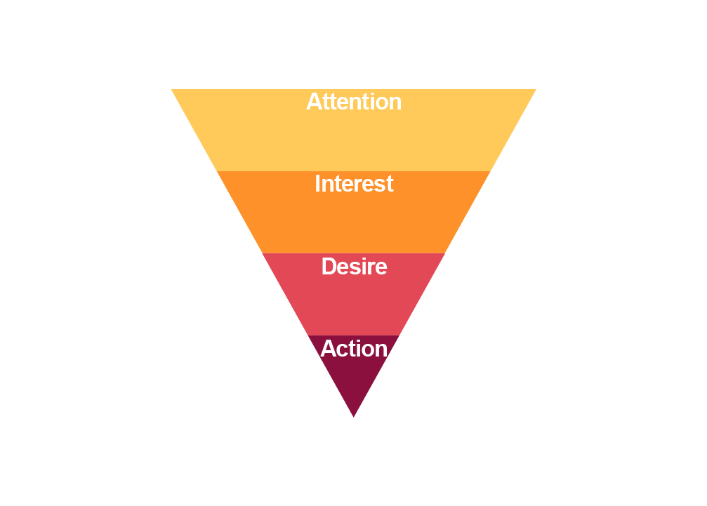
AIDA is a marketing practice model of consumer behavior that describes the sequence of events leading to a purchase decision:
Attention;
Interest;
Desire;
Action.
Let's try to apply AIDA principles to landing page design:
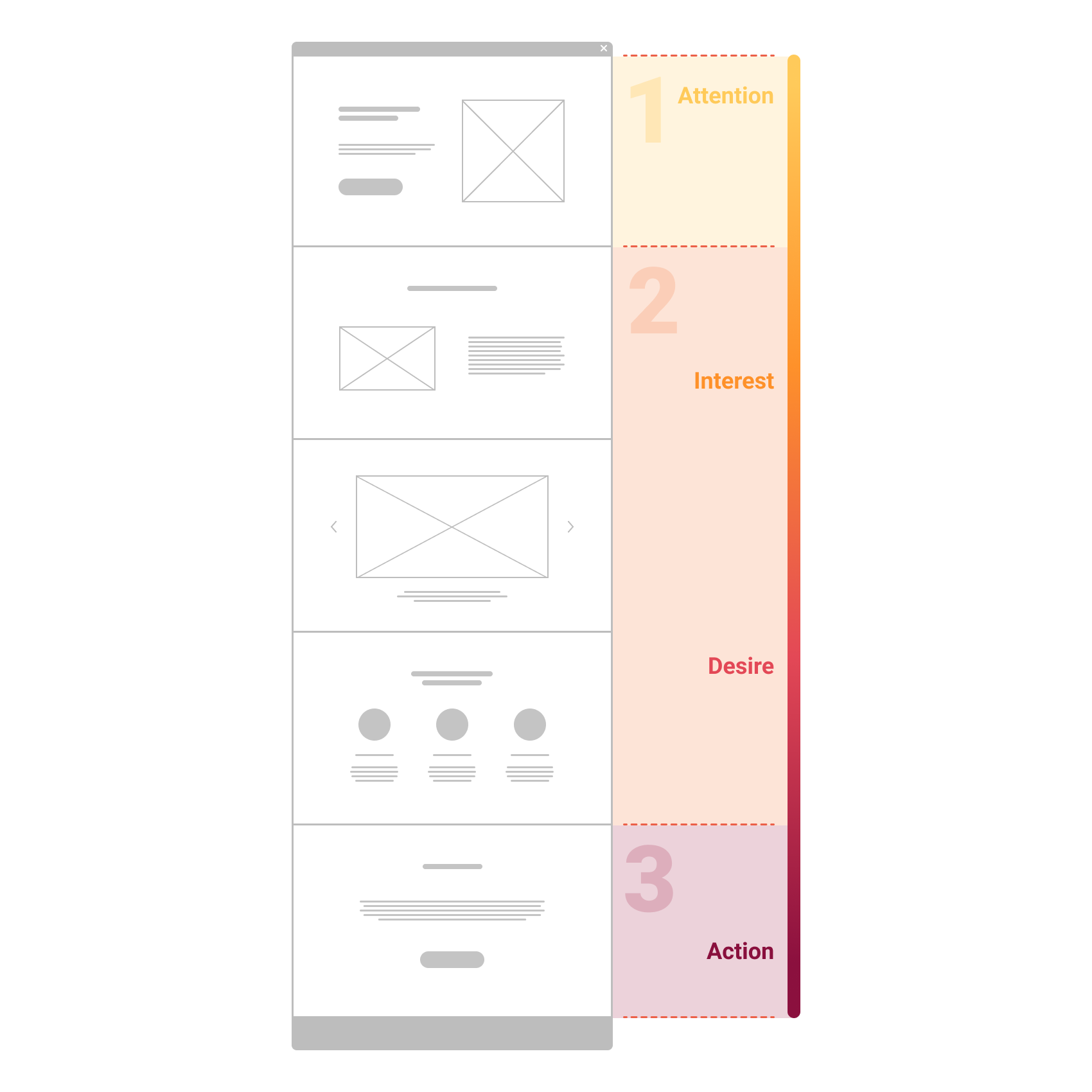
#1 Attention
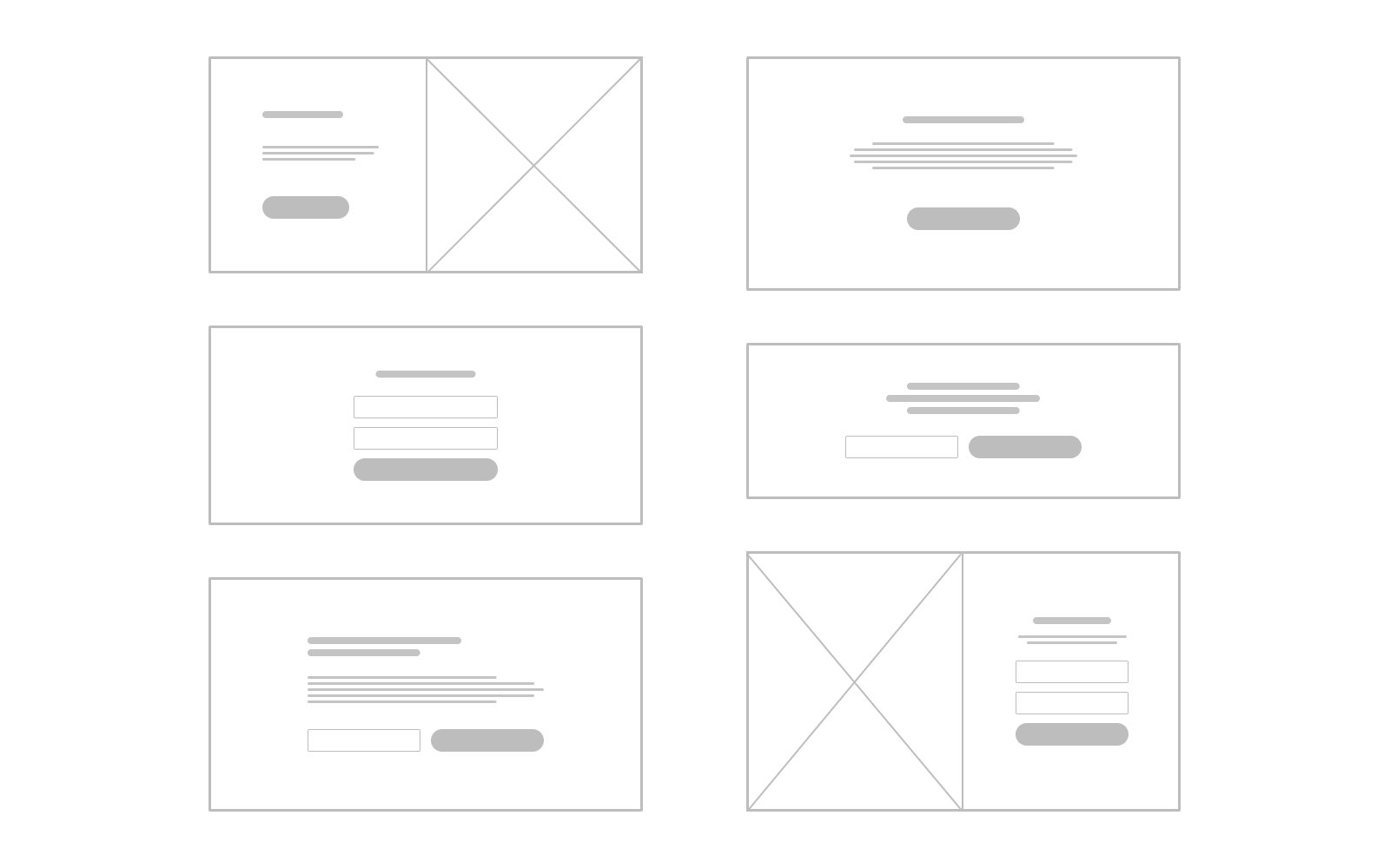
The first screen has a very important function - to attract attention and make an impression. It must answer the user's question "Where I am?" and prompt the user to scroll further.
This screen should contain:
Primary Headline - one of the main elements, here is the Value Proposition.
Secondary headline - explains the headline in more detail, reveals the essence of customer value and motivates to study the landing page. Must be short and meaningful.
The visual image should work for the main task - Conversion Centered Design. Usually these are pictures and photos for visual representation of a product or service. Visuals should not compete with texts and distract from the main message of the landing page.
Also, this page can contain elements such as:
- Logo
- Landing page navigation menu
- Contacts
- Call to Action
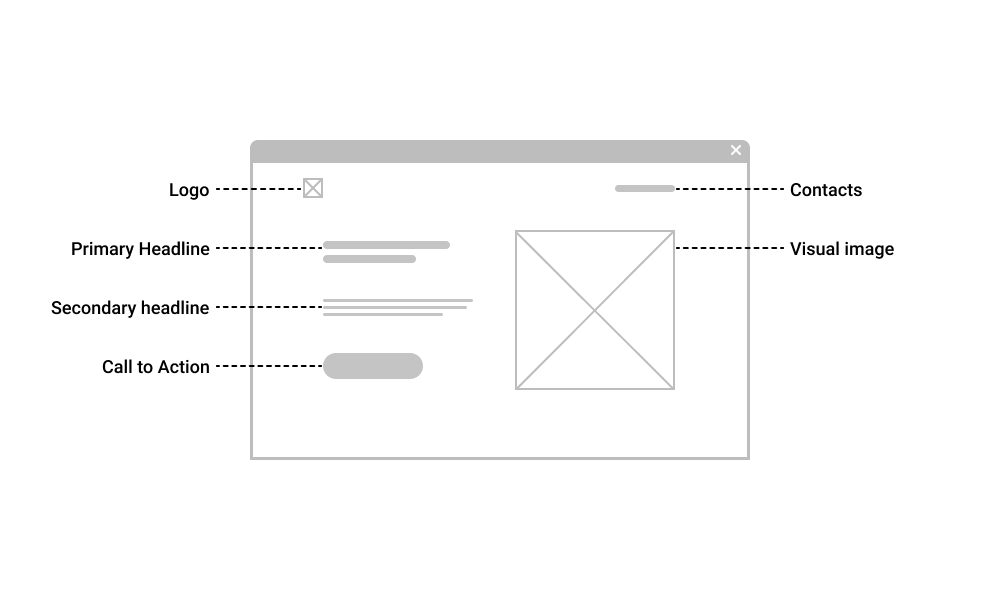
#2 Interest + Desire
So, when the page has attracted the user's attention, now it is necessary to maintain interest and generate desire.
Further information about the advantages and features of the product/service is placed.
Divide the information into several blocks of meaning.
Each block should answer one user question. The block should contain a title, a subtitle (optional) and content: text, image, video.
The sequence of the blocks must be logical and the blocks must be visually separated from each other.
Structure the text as much as possible, use lists. Avoid complex terminology and long sentences. Do not use links to other sites, this may distract the user from the desired action.
#3 Action
All the previous steps prepared the user for this action. The culmination of the landing page is the Call to Action and the Request Form.
Call to Action is usually expressed in the form of buttons "Buy", "Order", "Subscribe", etc.
If all the other elements of the landing page have worked well, then the call to action turns the average website visitor into a potential customer.
The CTA button should be effectively highlighted on the page, it should be clear and concise, call for only one action.
Finally, a great landing page structure is:
- The first screen that attracts attention and arouses interest;
- Several blocks with information about the offer, which should arouse the desire of the visitor.
- Call to Action button that attracts the visitor's eye.
Was this article helpful to you? Write comments and share on social networks :)